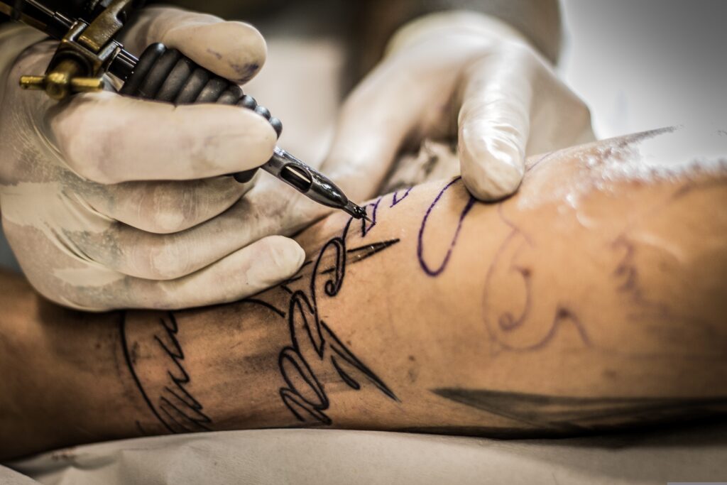
When it comes to script tattoos, the significance of proper spacing cannot be overstated. The arrangement of letters and words plays a crucial role in the overall aesthetic and readability of the tattoo. A well-spaced script tattoo not only enhances its visual appeal but also ensures that the intended message is conveyed clearly.
Poor spacing can lead to confusion, misinterpretation, or even an unintended message, which is why careful consideration must be given to this aspect during the design process. Moreover, proper spacing contributes to the longevity of the tattoo’s appearance. As skin ages and undergoes changes, the spacing between letters can become distorted if not executed correctly.
This can result in a tattoo that looks cluttered or illegible over time. Therefore, understanding the importance of spacing is essential for anyone considering a script tattoo, as it directly impacts both the immediate impression and the long-term integrity of the artwork.
Key Takeaways
- Proper spacing in script tattoos is crucial for readability and aesthetic appeal
- Common mistakes in script tattoo spacing include overcrowding, uneven spacing, and inconsistent letter size
- Tips for achieving ideal script tattoo spacing include using a professional tattoo artist, considering the placement, and choosing the right font
- Choosing the right font for your script tattoo is important for achieving the desired look and spacing
- Working with your tattoo artist is essential to ensure proper spacing and maintain the integrity of your script tattoo over time
Common Mistakes in Script Tattoo Spacing
One of the most prevalent mistakes in script tattoo spacing is inconsistent letter spacing. This occurs when some letters are spaced too closely together while others are too far apart, leading to an uneven and chaotic appearance. Such inconsistencies can distract from the overall message and make the tattoo difficult to read.
Additionally, many individuals underestimate the impact of kerning—the space between specific pairs of letters. Poor kerning can create awkward gaps or overlaps that disrupt the flow of the text. Another common error is neglecting to consider the size and style of the font when determining spacing.
Different fonts have unique characteristics that affect how they should be spaced. For instance, a cursive font may require more space between letters to maintain legibility, while a bold serif font might allow for tighter spacing without compromising clarity. Failing to account for these nuances can lead to a tattoo that appears cramped or disjointed, ultimately detracting from its intended beauty.
Tips for Achieving Ideal Script Tattoo Spacing
To achieve ideal script tattoo spacing, it is essential to start with a clear vision of the design. Before committing to a specific layout, consider how the words will flow together and how they will be perceived from different angles. Sketching out various arrangements can help visualize the final product and identify any potential spacing issues early on.
Additionally, using graph paper or digital design tools can assist in maintaining consistent spacing throughout the design process. Another effective tip is to consult with your tattoo artist about spacing preferences. Experienced artists often have a keen eye for detail and can provide valuable insights into how to best space your script tattoo.
They may suggest adjustments based on their expertise and understanding of how tattoos age over time. Collaborating with your artist ensures that you achieve a balanced and harmonious design that meets your expectations.
Choosing the Right Font for Your Script Tattoo
Selecting the right font is a critical step in creating a successful script tattoo. The font should not only reflect your personal style but also complement the message you wish to convey. For instance, a delicate cursive font may evoke feelings of romance or nostalgia, while a bold sans-serif font might convey strength and modernity.
It’s important to consider how the font aligns with your personality and the significance of the words being inked. Additionally, readability should be a top priority when choosing a font for your script tattoo. Some fonts may look beautiful on paper but become challenging to read when tattooed on skin.
It’s advisable to test out different fonts by printing them out or using digital mock-ups to see how they translate visually. A font that is too intricate may lose its clarity over time, so opting for a design that balances artistry with legibility is essential for a lasting impression.
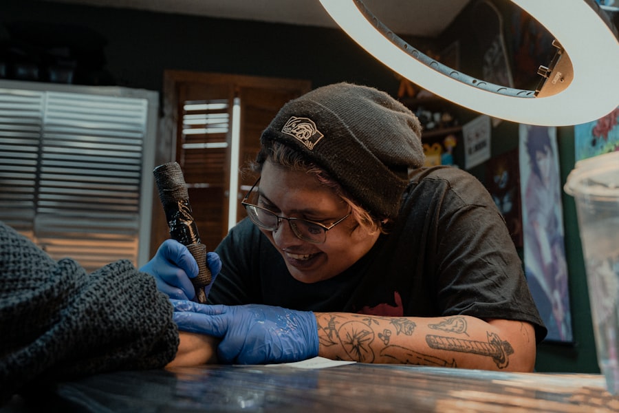
Working with Your Tattoo Artist to Ensure Proper Spacing
Collaboration with your tattoo artist is vital for achieving proper spacing in your script tattoo. A skilled artist will have experience in handling various fonts and styles, allowing them to provide guidance on how best to space your chosen text. During consultations, be open about your vision and any concerns you may have regarding spacing or design elements.
This dialogue fosters a collaborative environment where both you and your artist can work together to create a tattoo that meets your expectations. Moreover, don’t hesitate to ask for mock-ups or stencils before the actual tattooing process begins. This allows you to visualize how the spacing will look on your skin and make any necessary adjustments before committing to the final design.
Your artist’s expertise combined with your input will ensure that the final product reflects both your personal style and professional craftsmanship.
Understanding the Impact of Letter Size on Script Tattoo Spacing
The size of each letter in a script tattoo significantly influences its overall spacing and readability. Larger letters may require more space between them to maintain clarity, while smaller letters can often be placed closer together without losing legibility. Understanding this relationship is crucial for achieving a balanced design that looks cohesive and intentional.
Additionally, varying letter sizes within a single word or phrase can create visual interest but also complicate spacing decisions. For example, if certain letters are significantly larger than others, it may necessitate adjustments in spacing to ensure that the text flows smoothly. Being mindful of these factors during the design phase will help create a harmonious script tattoo that stands out for all the right reasons.
The Role of Placement in Script Tattoo Spacing
Placement is another critical factor that affects script tattoo spacing. The area of skin where the tattoo will be applied can influence how the letters are spaced and perceived. For instance, tattoos on curved surfaces, such as the forearm or shoulder, may require adjustments in spacing to accommodate the natural contours of the body.
A design that looks perfect on paper may need modifications when applied to skin due to these anatomical considerations. Furthermore, considering how the tattoo will interact with other tattoos or body features is essential for achieving an aesthetically pleasing result. If you have existing tattoos nearby, it’s important to think about how they will visually connect with your new script tattoo.
Collaborating with your artist on placement will ensure that your design complements your body’s unique landscape while maintaining proper spacing.
Maintaining the Integrity of Your Script Tattoo Over Time
Once you have successfully inked your script tattoo, maintaining its integrity over time becomes paramount. Proper aftercare is essential for preserving both the appearance and clarity of your tattoo. Following your artist’s aftercare instructions diligently will help prevent fading and distortion caused by sun exposure or improper healing.
Additionally, as skin ages, it’s important to be proactive about touch-ups if necessary. Over time, tattoos can blur or fade due to various factors such as sun exposure or changes in skin elasticity. Regularly moisturizing the area and protecting it from UV rays can help maintain its vibrancy and clarity.
If you notice any significant changes in your script tattoo’s appearance, consulting with your artist about potential touch-ups can ensure that it continues to look its best for years to come. In conclusion, achieving a beautiful script tattoo involves careful consideration of various factors including spacing, font choice, collaboration with your artist, and ongoing maintenance. By understanding these elements and taking proactive steps throughout the process, you can create a meaningful piece of art that stands out both now and in the future.


FAQs
What is script tattoo spacing?
Script tattoo spacing refers to the arrangement and distance between the letters in a script or cursive style tattoo. Proper spacing is crucial for legibility and aesthetic appeal of the tattoo.
Why is it important to avoid crowded lettering in script tattoos?
Crowded lettering in script tattoos can make the tattoo difficult to read and can also affect the overall visual appeal of the design. Proper spacing ensures that the tattoo is clear and easy to understand.
How can I avoid crowded lettering in my script tattoo?
To avoid crowded lettering in a script tattoo, it is important to work with a skilled and experienced tattoo artist who understands the importance of proper spacing. Additionally, choosing the right font and size for the script can also help in avoiding crowded lettering.
What are some tips for achieving proper script tattoo spacing?
Some tips for achieving proper script tattoo spacing include choosing a font that is designed for readability, ensuring that the letters are evenly spaced, and considering the placement of the tattoo on the body to ensure that the script flows naturally.
Are there any common mistakes to avoid when it comes to script tattoo spacing?
Common mistakes to avoid when it comes to script tattoo spacing include overcrowding the letters, uneven spacing between letters, and not considering the natural flow of the script when placing the tattoo on the body.