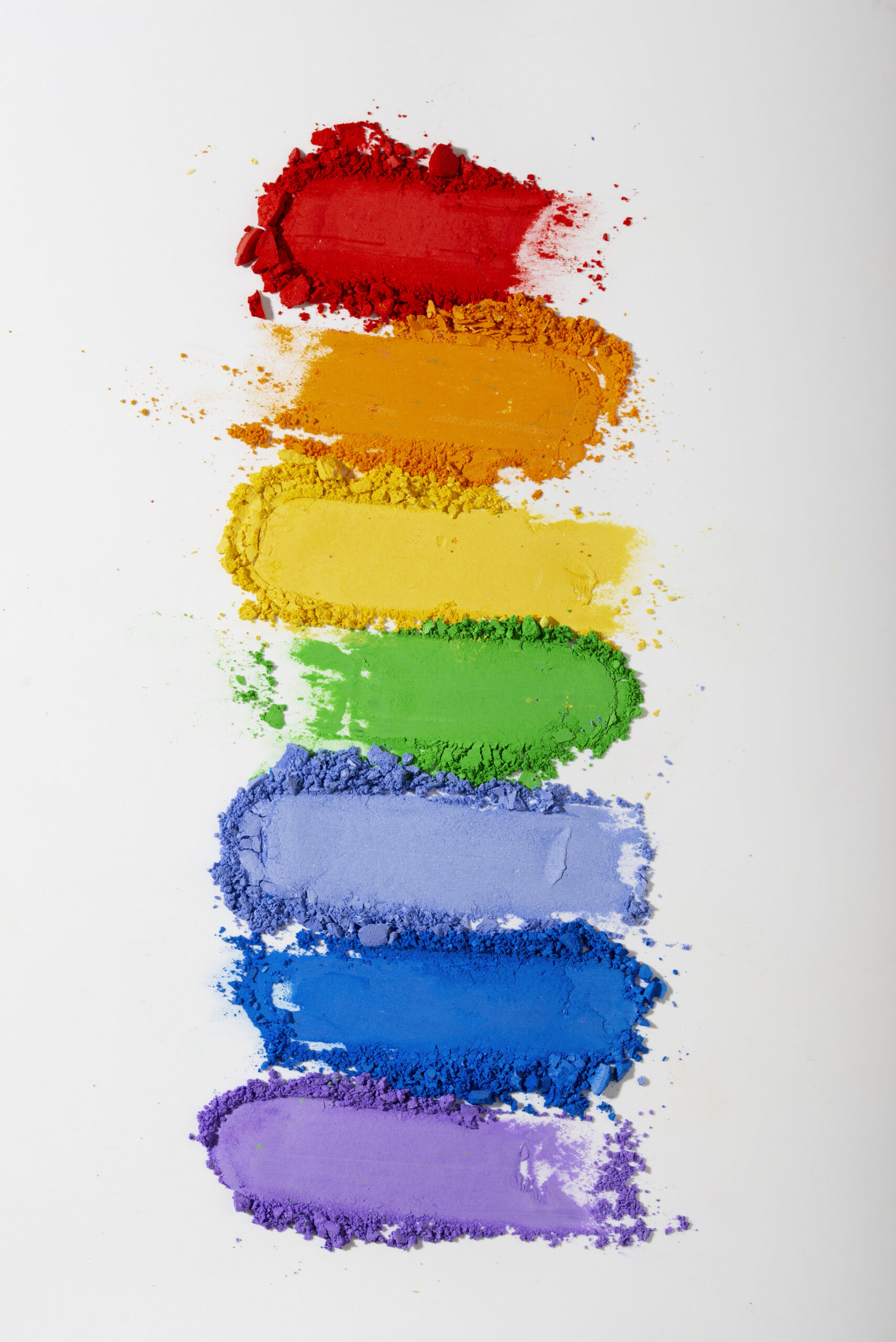
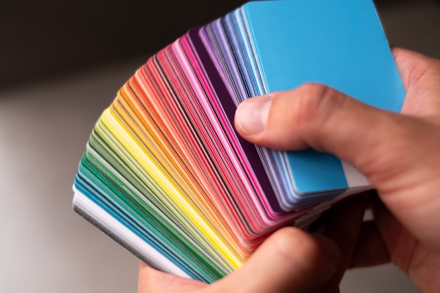
Color theory is a fundamental aspect of art and design that explores how colors interact with one another. It encompasses the relationships between colors, the emotional responses they evoke, and the visual harmony they can create when combined. At its core, color theory is divided into three primary categories: primary, secondary, and tertiary colors.
Primary colors—red, blue, and yellow—serve as the building blocks for all other colors. By mixing these primary colors, artists can create secondary colors like green, orange, and purple. Tertiary colors emerge from mixing primary and secondary colors, resulting in a rich spectrum that can be utilized in various artistic expressions, including tattoo design.
In the context of tattoo artistry, understanding color theory is crucial for creating visually appealing designs that resonate with the wearer. Colors can convey emotions and meanings, influencing how a tattoo is perceived. For instance, warm colors like red and orange often evoke feelings of passion and energy, while cool colors such as blue and green can impart a sense of calmness and tranquility.
By grasping the principles of color theory, tattoo artists can make informed decisions about color combinations that enhance the overall impact of their work.


Key Takeaways
- Understanding color theory is essential for creating visually appealing tattoos
- Complementary color palettes can create striking and dynamic tattoo designs
- Choosing the right complementary colors is crucial for achieving the desired effect in a tattoo
- Creating depth and dimension with complementary colors can make a tattoo more visually interesting
- Incorporating complementary color palettes into traditional tattoo styles can add a modern twist to classic designs
Complementary Color Palettes in Tattoo Design
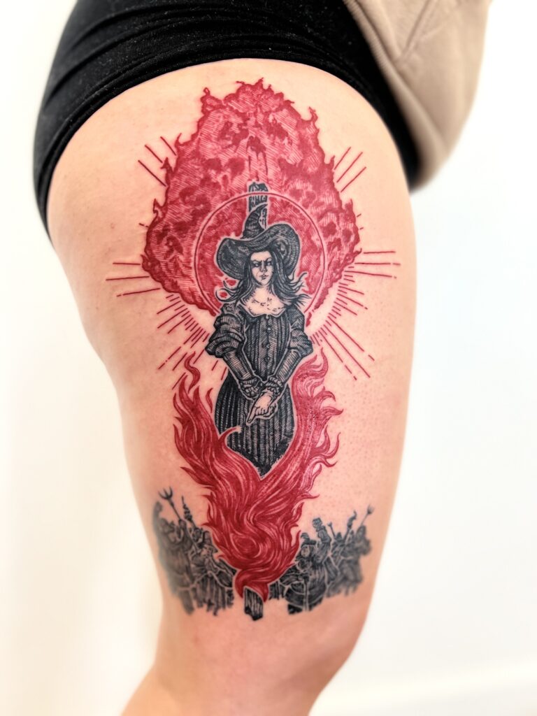
Complementary color palettes are formed by pairing colors that are opposite each other on the color wheel. This relationship creates a striking contrast that can make designs pop and draw attention. In tattoo design, complementary colors can be used to highlight specific elements of a piece, adding depth and vibrancy to the overall composition.
For example, pairing blue with orange or red with green can create a dynamic visual experience that captures the eye and enhances the narrative of the tattoo. The use of complementary colors in tattoos is not merely about aesthetics; it also serves to convey meaning and emotion. The contrast between complementary colors can symbolize duality or balance, making them an excellent choice for tattoos that represent opposing forces or concepts.
Whether it’s the yin and yang of life or the interplay between love and loss, complementary color palettes can effectively communicate complex ideas through visual art.
Choosing the Right Complementary Colors for Your Tattoo
Selecting the right complementary colors for a tattoo involves careful consideration of both personal preference and the intended message of the design. It’s essential to think about how different colors resonate with you on an emotional level. For instance, if you are drawn to vibrant hues that evoke energy and excitement, you might opt for a combination like yellow and purple.
Conversely, if you prefer a more subdued palette that conveys tranquility, blue and orange could be a fitting choice. Additionally, the context of the tattoo plays a significant role in color selection. Consider the theme or subject matter of your tattoo; certain colors may enhance its meaning or narrative.
For example, a floral design might benefit from complementary colors that reflect nature’s vibrancy, such as pink and green. Ultimately, choosing complementary colors should be a collaborative process between the wearer and the tattoo artist, ensuring that the final design aligns with both aesthetic preferences and personal significance.

Creating Depth and Dimension with Complementary Colors
One of the most compelling aspects of using complementary colors in tattoo design is their ability to create depth and dimension. When applied skillfully, these contrasting hues can give the illusion of three-dimensionality, making elements of the tattoo appear to pop off the skin. This effect is particularly effective in designs that incorporate shading or gradients, where complementary colors can be blended to enhance the overall visual impact.
For instance, a tattoo featuring a sunset might utilize shades of orange and blue to create a sense of depth in the sky. The warm tones of orange can represent the sun’s glow, while the cool blues provide a backdrop that enhances the vibrancy of the foreground elements. By strategically placing complementary colors within a design, artists can guide the viewer’s eye and create a more immersive experience.
Incorporating Complementary Color Palettes into Traditional Tattoo Styles
Traditional tattoo styles often rely on bold lines and limited color palettes to convey their messages effectively. However, incorporating complementary color palettes into these styles can breathe new life into classic designs. For example, American traditional tattoos typically feature bright primary colors; adding complementary shades can enhance their visual appeal while maintaining their iconic look.
Incorporating complementary colors into traditional styles requires a delicate balance between innovation and respect for established techniques. Artists must consider how these new color combinations will interact with traditional motifs while ensuring that they remain true to the essence of the style. This approach not only revitalizes classic designs but also allows for greater personalization, enabling wearers to express their individuality through unique color choices.
Cultural and Symbolic Meanings of Complementary Colors in Tattoos
Colors carry significant cultural and symbolic meanings across different societies, making them an essential consideration in tattoo design. Complementary colors can amplify these meanings by juxtaposing contrasting ideas or themes. For instance, in many cultures, red symbolizes passion or love, while green often represents growth or renewal.
When used together in a tattoo, these complementary colors can convey a narrative about love’s transformative power or the balance between passion and tranquility. Moreover, understanding cultural associations with specific colors can enhance the significance of a tattoo for the wearer. In some cultures, certain color combinations may hold particular spiritual or historical meanings.
For example, in Hinduism, saffron (a shade of orange) is associated with purity and spirituality, while blue represents divine qualities. By thoughtfully selecting complementary colors that resonate with cultural symbolism, individuals can create tattoos that honor their heritage while expressing personal beliefs.
Tips for Maintaining the Integrity of Complementary Color Tattoos Over Time
Maintaining the integrity of complementary color tattoos requires ongoing care and attention to ensure that they remain vibrant and visually striking over time. One of the most critical factors in preserving color quality is proper aftercare immediately following the tattooing process. Following your artist’s aftercare instructions diligently will help prevent fading and ensure optimal healing.
In addition to initial care, ongoing maintenance is essential for preserving color vibrancy. This includes protecting your tattoo from prolonged sun exposure by applying sunscreen or wearing protective clothing when outdoors. UV rays can significantly fade tattoos over time, particularly those with bright or bold colors.
Regular moisturizing can also help keep the skin healthy and maintain the clarity of your tattoo’s colors.
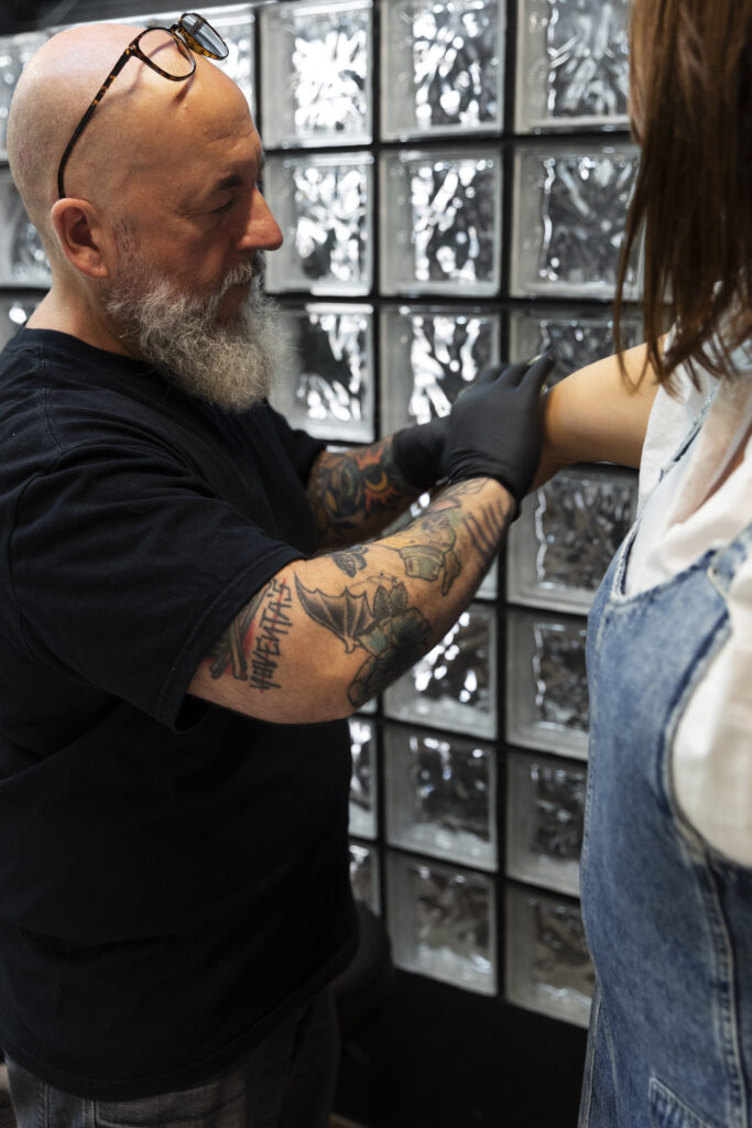
Finding the Right Tattoo Artist for Complementary Color Designs
Choosing the right tattoo artist is crucial when it comes to executing complementary color designs effectively. Not all artists specialize in color work; therefore, it’s essential to research potential artists’ portfolios to assess their experience with vibrant color palettes and complementary combinations. Look for artists who demonstrate a strong understanding of color theory in their work and have successfully executed similar designs.
Additionally, communication is key when working with an artist on a complementary color tattoo. Be prepared to discuss your vision openly and collaboratively explore color options together. A skilled artist will not only listen to your ideas but also provide valuable insights based on their expertise in color application and design composition.
By finding an artist who aligns with your aesthetic preferences and understands your vision for complementary colors, you can ensure that your tattoo will be both visually stunning and personally meaningful. In conclusion, understanding color theory and its application in tattoo design opens up a world of creative possibilities for both artists and wearers alike. Complementary color palettes offer unique opportunities to enhance visual impact while conveying deeper meanings through contrast and harmony.
By carefully selecting complementary colors, creating depth within designs, incorporating them into traditional styles, acknowledging cultural significance, maintaining tattoos over time, and finding the right artist, individuals can achieve stunning tattoos that resonate on multiple levels.
FAQs
What is color theory in tattoo design?
Color theory in tattoo design refers to the principles and guidelines for combining and using colors effectively in tattoos. It involves understanding the color wheel, color relationships, and how different colors interact with each other to create visually appealing designs.
What are complementary palettes in color theory?
Complementary palettes in color theory refer to pairs of colors that are opposite each other on the color wheel. When used together, complementary colors create a strong contrast and can make each other appear more vibrant. In tattoo design, using complementary palettes can create visually striking and dynamic designs.
How are complementary palettes used in tattoo design?
Tattoo artists use complementary palettes to create visually impactful designs by strategically incorporating pairs of complementary colors into their artwork. By understanding how complementary colors interact, artists can create tattoos with a strong visual impact and a sense of balance.
What are some examples of complementary color pairs in tattoo design?
Examples of complementary color pairs include red and green, blue and orange, and yellow and purple. When used together in tattoo design, these pairs of colors can create visually striking and harmonious compositions.
Why are complementary palettes important in tattoo design?
Complementary palettes are important in tattoo design because they can help create visually dynamic and balanced tattoos. By understanding and utilizing complementary colors, tattoo artists can enhance the overall impact and vibrancy of their designs.